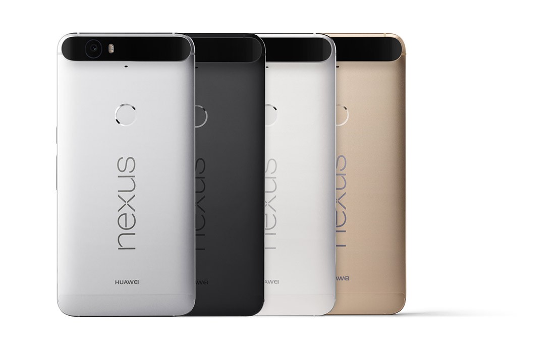
Nexus 6P Outshines its Competitors

Nexus6Google’s Nexus 6P is finally out. The phone is decent and is an improvement of its predecessor.

Design

Nexus 6P is a large and heavy phone but thankfully, Nexus 6P is manageable. The screen size has drastically dropped from 5.96 to 5.7 inches. The handset’s dimension has reduced in both weight and thickness. This has finally allowed the new phone to sit comfortably in the hand. Through the round edges on the rear, it easily snuggles in your palm, yet it becomes tricky to reach everywhere on the screen with one hand. Surprisingly, the metal unibody has provided a premium appeal to the handset.

Display

The smartphone boasts a screen size of 5.7 which is quite shiny, with a colorful band and extremely responsive under the touch. Everything seems exceptionally sharp on the screen with the QHD resolution while colors turn vibrant with the AMOLED technology. The screen is protected with Gorilla Glass 4 that helps it survive a number of knocks, and is coated in fingerprint and smudge resistance. The screen display runs at a 1440p resolution that translates to 518 pixels per inch. Design wise, the smartphone was made of “aeronautical-grade aluminum” and has come in three colors – graphite, frost, and aluminum, giving it a premium feel.

Camera

Nexus 6P features a rear camera of 12.3MP with laser autofocus that instantly focuses on objects. In also incorporates a slow-motion mode that captures 240 frames per second and 4K video recording. With regards to the front-facing selfie camera, it sports an 8MP camera with an f/2.4 aperture and HDR+ provided for HD selfies for your Instagram account.

Specifications

Under the hood, the phablet features a Snapdragon 810 V2.1 processor with 3GB RAM which is another impressive specification in the Nexus 6P. The phone comes preinstalled with Google’s all new Android 6.0 Marshmallow, that brings along features including Doze mode, a battery saving mode called the ‘biggest breakthrough to date with regards to the battery life of smartphones’.

This is by far the best looking Nexus phone when it comes to the visual allure.
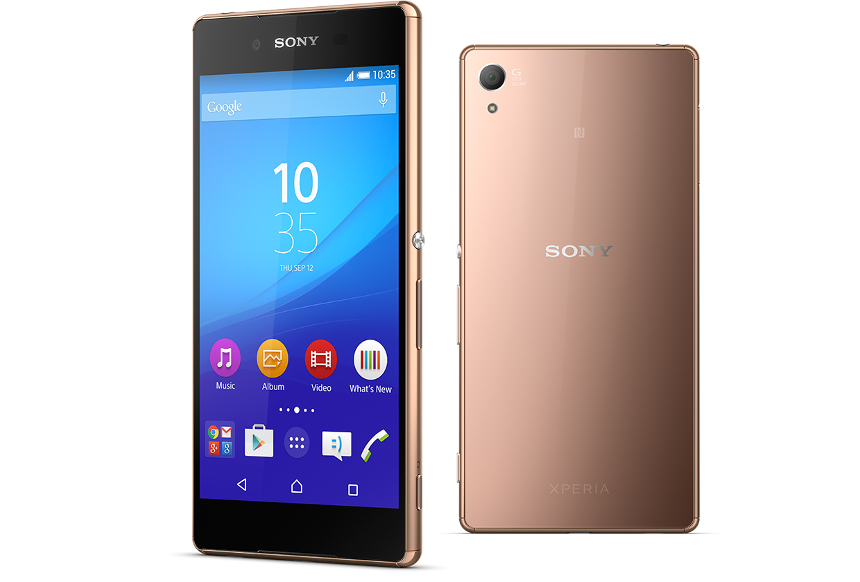
Why Sony Xperia Z3+ Should Be Your Next Smartphone

sony experia z3+

Sony did not take long to launch its next phone after Xperia Z3, the Z3+. But does this next version have enough advancements that it will maintain itself in the market for a longer duration? Here’s a peek at the new handset that has recently hit the market.

Premium Design

Sony has always been incredible with smartphone designs. From the very first model of Xperia, through the Z3+, the overall impeccable quality pretty much stands out against the competition.

The Z3+ comes with a sleek body with front and rear glass panels that have set a trend that even Samsung is copying. It just weights 144 grams even with a display of 5.2 inches and a 2930 mAh battery. Adding more to that is an IP68 waterproof feature, which means it can be submerged in 1.5 meters of water for a duration of 30 minutes. The USB is not covered by a flap and the sim slot and microSD slots have been moved to one area.

Software and Camera

This new smartphone comes with Android Lollipop running on a 64bit Qualcomm Snapdragon 810 octa-core processor. With 3GB RAM, 32 GB inbuilt storage, and 128 GB expandable memory, it is quite impressive. Like the Z3, the new Xperia also has a 5Mp front camera and a 20.7-megapixel rear autofocus with image stabilizer, wide angle lens and 4K recording.

PS4 Remote Play

PS4 is Sony’s power differentiator as it works remotely on your smartphone. It has gradually become the core part of the gaming time. PS4 is popular as it is quick, easy to setup and works well.

This Xperia is a completely feature-packed smartphone. Where other smartphone manufacturers sacrifice features for their design, Sony packs them all in one. The new Sony Xperia Z3+ retains all the features regarding connectivity including 4G Internet, Bluetooth 4.1, micro USB port, WiFi Hotspot, and GPS with AGPS.

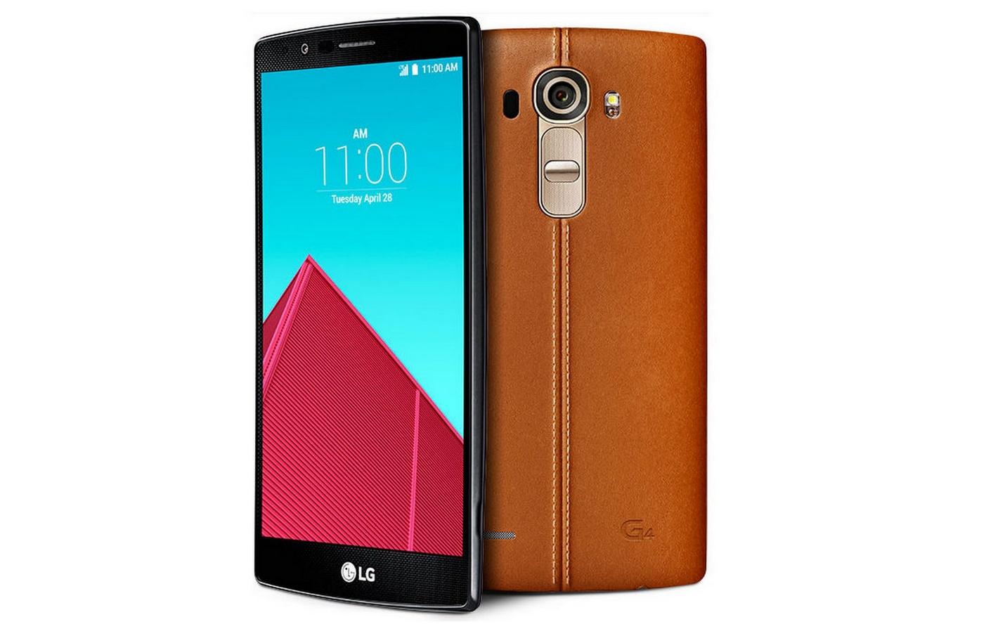
LG G4 Doesn’t Live up to the Wait

LG G4

After immense hard work, LG has managed to deliver likeable phones and has revamped its branding. The LG G3 was released on May 2014, and after a yearlong wait the next upgraded phone LG G4 was launched in April this year. However, it fared differently than the expectations. Let’s see how.

Design

Surprisingly, LG didn’t do anything drastic to the new design as the changes are just conservative. The buttons are still on the back though it is an inch taller and wider than the other phones in its class including the HTC One M9 and 2014 Moto X. The G4 keeps the rear button layout that has become a landmark of every other LG phone. The 5.5-inch phone is too large to carry in the pocket.

Display

Just like its predecessor, it also uses a QHD panel which is incredible. LG has thankfully improved its color quality and direct sunlight performance when compared to the last year’s model. The IPS Quantum display and N-Type liquid crystals are one of the best in the market right now with 25% more brightness. With a 1440 x 2560 pixel display and corning Gorilla Glass 3, it simply looks amazing.

Software

LG again falls into the common trap of making arbitrary changes to the Android interface. The Lollipop (5.1) operating system upgrade provided no user facing benefit. A weird LG app store has been introduced with two different superfluous voice command systems that involves weather forecasting and basic getting-started tips.

Specification and Hardware

With 32 GB internal memory and 3 GB of Ram, it also adds on with a 16MP LED rear camera and 8MP front camera. To its credit, LG has added some useful specifications like the Dual Window mode but it has a limited breadth app support. Certain lags have also been noticed in the recent LG G4 which doesn’t always operate smooth. The 3000 mAh battery life, however, may be considered a positive aspect.

Conclusion

The G4 can be considered as a fine yet not an exceptional device. It needs to offer something that goes beyond what everyone else is delivering, something that will create a richer user experience.